
Reference guide for the Marquee module in DiviAnimator.
Overview #
Marquee scrolls a row of items (logos, text, images, or other content) across the page in a continuous loop. You choose the items, the direction, the speed, and the space between items.
| Tab | What it controls |
| Content | The items, scroll behavior, background, admin label |
| Design | Item size and styling, and module styling |
| Advanced | CSS ID and classes, custom CSS, device visibility, overflow, transitions, position |
Requirements #
- Divi 5, installed and active.
- DiviAnimator, installed and active with a valid license.
- The Marquee module switched on in DiviAnimator > Modules.
How to Enable Marquee #
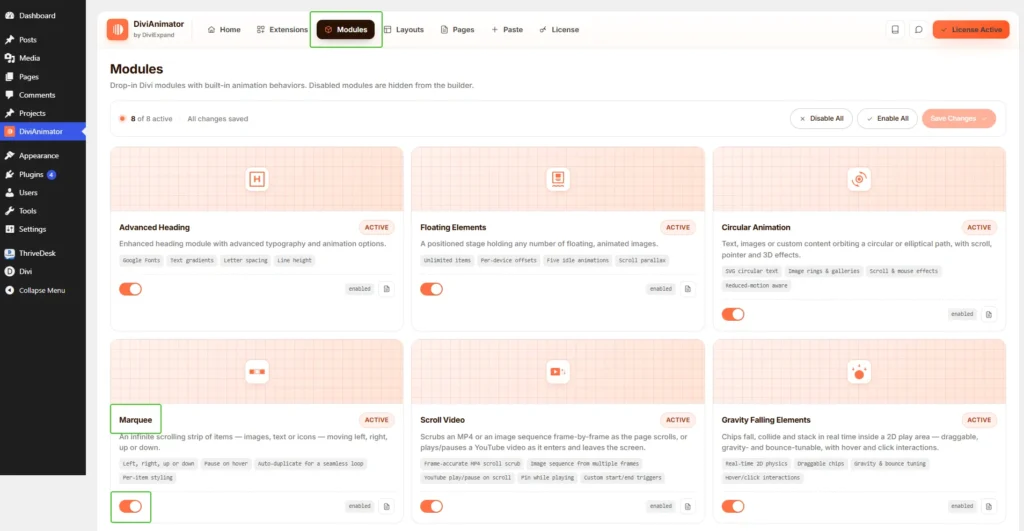
- In the WordPress dashboard, go to DiviAnimator and open the Modules tab.
- Find the Marquee card.
- Turn on its toggle. The label next to the toggle changes to "enabled".
- Click Save Changes at the top right. The page shows "Unsaved changes" until you save.
- Open a page in the Divi builder, search for "Marquee" in the module picker, and add it to a column.
If Marquee is missing from the module picker, go back to DiviAnimator > Modules. Check that its toggle is on and that you saved. A disabled module is hidden from the builder. Enable All and Disable All at the top of the page switch every module at once.
Quick Start #
- Add the Marquee module to a column.
- In the Content tab, open Elements and fill in each Marquee Item, or click Apply Structure Template for a ready-made set.
- Open Marquee and set Direction, Speed, and Gap.
- In the Design tab, set the Item Width and Item Height.
- Preview the page.
Content Tab #
Elements #
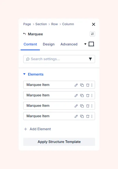
The list holds every item in the marquee. A new module starts with four items, each named Marquee Item. Each row has icons to edit, duplicate, or delete the item, plus a menu icon for more actions.
- Edit: change the item's content.
- Duplicate: copy an item with its content.
- Delete: remove the item.
- Add Element: add a new item to the end of the list.
- Apply Structure Template: apply a ready-made set of items. Edit each one afterward.
Items scroll in the order they appear in the list.
Marquee Item settings #
Click the edit icon on an item to open its settings. The Content tab of an item has these groups:
- Text: the item's written content.
- Generate Content With AI: drafts text for the item. Review it before you publish.
- Title: the item's heading. It also names the item in the Elements list.
- Body: the item's text, in the standard Divi editor. Use Visual to format text as you see it, or Text to edit the HTML. Add Media inserts an image or file into the body.
- Image & Icon: adds an image or an icon to the item.
- Link: makes the item link to a URL.
- Background: sets a background for this item only.
- Admin Label: a builder-only name for the item.
The body text of a new item is placeholder text. Replace it with your own.
Marquee #
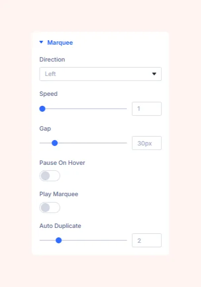
Controls how the row scrolls.
- Direction: which way the items move.
- Speed: how fast the items move. Higher is faster.
- Gap: the space between items, in px.
- Pause On Hover: when on, the scrolling stops while the visitor's mouse is over the marquee, and resumes when the mouse leaves.
- Play Marquee: when on, the marquee runs in the builder so you can preview the movement.
- Auto Duplicate: how many times the item set is repeated to fill the row. If a gap shows before the items loop around, raise this value or add more items.
Background #
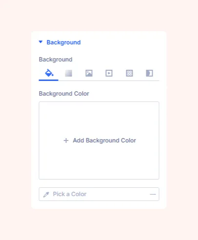
Sets the module background. Pick a type from the icons: color, gradient, image, video, pattern, or mask. For a solid color, click Add Background Color or use the color picker.
Admin Label #
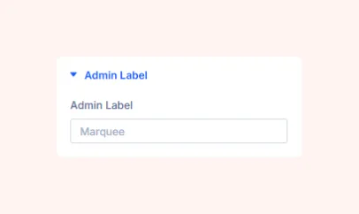
A name that only you see in the builder. Use it to tell several Marquee modules apart on one page.
Design Tab #
Items #
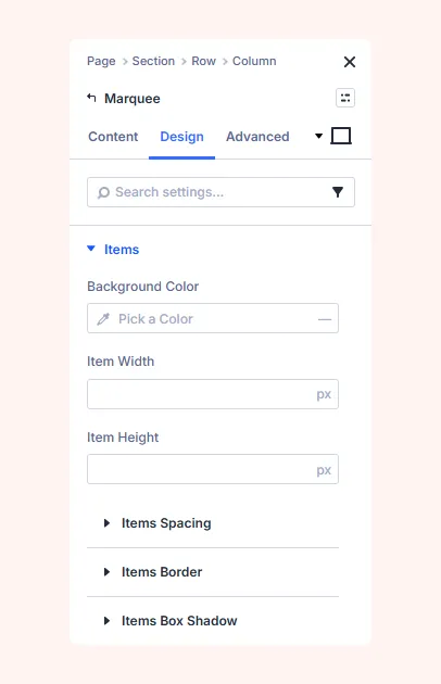
Styles every item in the marquee at once.
- Background Color: the background color behind each item.
- Item Width: the width of each item, in px.
- Item Height: the height of each item, in px.
- Items Spacing: margin and padding for each item.
- Items Border: border and rounded corners for each item.
- Items Box Shadow: a shadow behind each item.
Set Item Width and Item Height for equal-sized items. Leave them empty to let each item size itself to its content. To space items apart, use Gap in the Content tab.
Sizing #
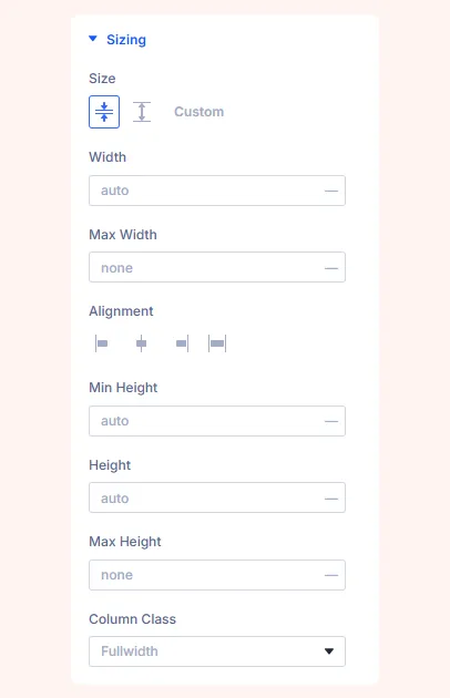
Controls the size of the module itself.
- Size: presets, or Custom.
- Width / Max Width: module width and the limit it cannot pass.
- Alignment: left, center, right, or full width in the column.
- Min Height / Height / Max Height: smallest, normal, and largest height.
- Column Class: the column width the module uses.
Spacing #
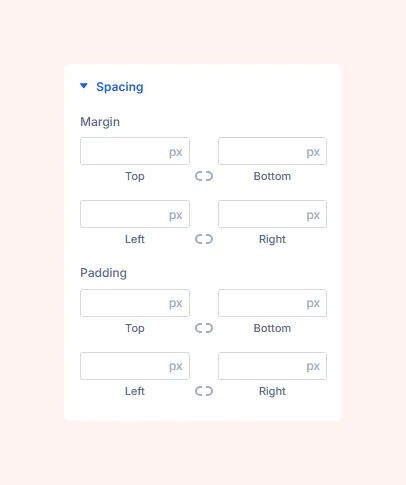
- Margin: space outside the module.
- Padding: space inside the module, around the items.
Each side has its own field. The link icon locks sides together.
Border #
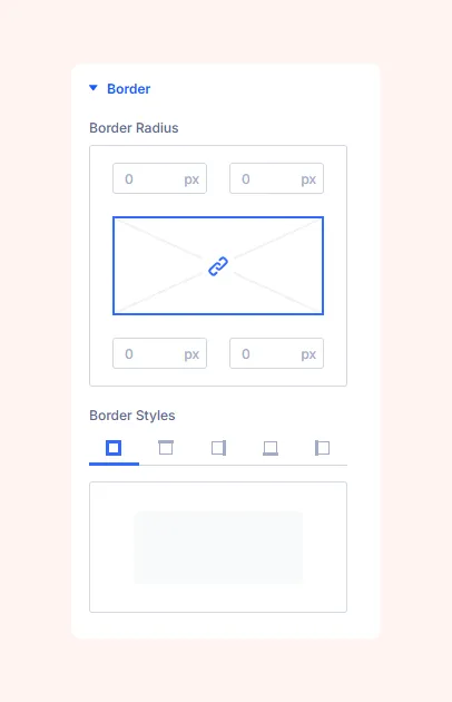
- Border Radius: rounds the module's corners. The link icon changes all four together.
- Border Styles: style all sides, or pick one side.
- Border Width, Color, and Style: thickness, color, and line type of the border.
This border surrounds the whole marquee. Use Items Border to style each item.
Box Shadow #
Eight presets. The first removes the shadow. The others vary in size, direction, and softness.
Filters #
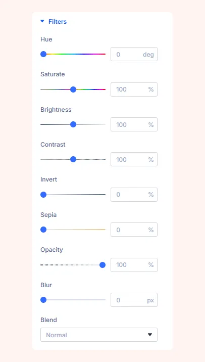
Photo-style effects for the whole module: Hue, Saturate, Brightness, Contrast, Invert, Sepia, Opacity, Blur, and Blend (how colors mix with what is behind the module).
Transform #
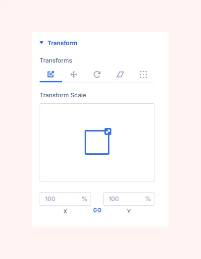
Changes the size, position, or angle of the module. Choose a type from the icons: Scale, Translate, Rotate, Skew, or Origin.
- Scale: makes the module larger or smaller. X is width and Y is height. The link icon keeps both equal.
- Translate: moves the module sideways or up and down.
- Rotate: turns the module.
- Skew: slants the module.
- Origin: the point the other transforms pivot around.
Advanced Tab #
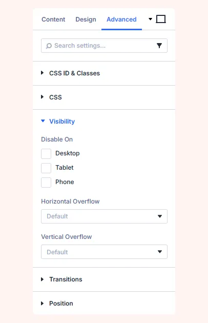
These five groups are standard Divi settings shared by most modules.
CSS ID & Classes #
Names for targeting the module with CSS or JavaScript.
- CSS ID: a unique name for this module. Use each ID once per page.
- CSS Class: a reusable name. Separate several with spaces.
CSS #
Custom CSS for the module, with separate fields for its parts. Divi adds the selector, so you only write the properties.
Visibility #
- Disable On: tick Desktop, Tablet, or Phone to hide the module on that device size.
- Horizontal Overflow / Vertical Overflow: what happens to content that extends past the module's edge. Leave both on Default unless you need to clip or scroll the content.
Transitions #
Sets how smoothly the module changes between states, such as on hover: how long the change takes, how long it waits before starting, and its speed curve.
Position #
Controls where the module sits in the layout: in the normal flow, offset from it, or pinned in place. Z Index sets which element appears in front when two overlap.
Troubleshooting #
The marquee does not move #
Check that Speed is above 0. In the builder, turn on Play Marquee to preview the movement.
There is a gap before the items repeat #
Raise Auto Duplicate, or add more items.
The speed or spacing is wrong #
Change Speed to move faster or slower. Change Gap to move items closer together or further apart.
The items have different sizes #
Set Item Width and Item Height in the Design tab so every item uses the same size.
The marquee is missing on one device #
Check Disable On in the Advanced tab. Make sure that device size is not ticked.
The marquee does not pause on hover #
Turn on Pause On Hover. Touch screens have no hover, so this setting has no effect on phones and tablets.
Support #
For help with the Marquee module, contact support@diviexpand.com.


